Jump to content

Rate the Photo Above you

2 hours ago, Emzijs said:

9/10. Not sure what I don't like but something is missing there.

The leading lines ate leading over and away from the bike, so my eyes are actually first drawn past the bike. Maybe re position lower so you see the grated overpass floor lead to the bike, that would also remove some of the metalwork from appearing through the bike. Also, the bike is blurry. I can't tell if it's out of focus or if you had too slow of shutter speed and shaking. 


I do like the coloration though and what you are going for. 


29248745753_34103a53a1_b.jpg
by Ethan Gollehon, on Flickr

D3SL91 | Ethan | Gaming+Work System | NAS System | Photo: Nikon D750 + D5200

Link to comment
Share on other sites

Link to post
Share on other sites

  • 2 weeks later...

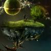
9/10 Ethan, nice one! i'd only get a littlebit more yellow tone in it, it's very cold now.the grass ain't that green. Take it into camera raw and go to the tab where you can spice up the saturation per color. If this is your taste, ignore me ^^


BTW my first post in here, so i thought i'd send in a pretty extreme/dramatic image. This image probably won't be everyone's liking, but it's different :D


_MSF7446_HDR (Custom).jpg

Link to comment
Share on other sites

Link to post
Share on other sites

On 10/2/2016 at 7:02 PM, Easygoingmartin said:

9/10 Ethan, nice one! i'd only get a littlebit more yellow tone in it, it's very cold now.the grass ain't that green. Take it into camera raw and go to the tab where you can spice up the saturation per color. If this is your taste, ignore me ^^


BTW my first post in here, so i thought i'd send in a pretty extreme/dramatic image. This image probably won't be everyone's liking, but it's different :D


_MSF7446_HDR (Custom).jpg

8/10

The picture itself is good, but I'm just not a huge fan of the processing on it. It makes it look too artificial and takes away from the "emotion" in the photo.


Mine is from the grotto at Notre Dame University.

JPG-2070.jpg

Link to comment
Share on other sites

Link to post
Share on other sites

On 10/4/2016 at 4:11 PM, dobo2001 said:

8/10

The picture itself is good, but I'm just not a huge fan of the processing on it. It makes it look too artificial and takes away from the "emotion" in the photo.


Mine is from the grotto at Notre Dame University.

JPG-2070.jpg

I really like this one. Maybe crop out the green on the right to keep it a more monotone photo but with the orange from the flames. 9/10


image.jpg

This is from the Kendov Dvorak (totaly butchered the spelling here) bed and breakfast in Idrja Slovenia. 

ASU

Link to comment
Share on other sites

Link to post
Share on other sites

On 10/4/2016 at 5:11 PM, dobo2001 said:

8/10

The picture itself is good, but I'm just not a huge fan of the processing on it. It makes it look too artificial and takes away from the "emotion" in the photo.


Mine is from the grotto at Notre Dame University.

Really minor thing but that little strip of purple on the left is bugging me... :D 

Solve your own audio issues  |  First Steps with RPi 3  |  Humidity & Condensation  |  Sleep & Hibernation  |  Overclocking RAM  |  Making Backups  |  Displays  |  4K / 8K / 16K / etc.  |  Do I need 80+ Platinum?

If you can read this you're using the wrong theme.  You can change it at the bottom.

Link to comment
Share on other sites

Link to post
Share on other sites

dogwood22.jpg

9/10 I love the bokeh!

  This is a photo that I took of my friend about a week ago

Link to comment
Share on other sites

Link to post
Share on other sites

1 hour ago, LaundyGoggles said:

9/10 I love the bokeh!

  This is a photo that I took of my friend about a week ago

I like the pose but the 1 colour thing doesn't add anything to it imo, and maybe even causes confusion... what is the important thing here, the person or the shirt?

Also I feel like rotating the camera to an "odd angle" (not level) might have been a cool effect for this one.

7/10


I have nothing to post right now, so ... someone else can rate you too and keep the chain going :P 

Solve your own audio issues  |  First Steps with RPi 3  |  Humidity & Condensation  |  Sleep & Hibernation  |  Overclocking RAM  |  Making Backups  |  Displays  |  4K / 8K / 16K / etc.  |  Do I need 80+ Platinum?

If you can read this you're using the wrong theme.  You can change it at the bottom.

Link to comment
Share on other sites

Link to post
Share on other sites

22 hours ago, LaundyGoggles said:

dogwood22.jpg

9/10 I love the bokeh!

  This is a photo that I took of my friend about a week ago

6/10    Not a lot to look at. The leading lines of the brick going horizontally kinda take away the focus from the subject. Me personally, I just am not a huge fan of single color B&W photos. 


Another from the ND game

JPG-2726.jpg

Link to comment
Share on other sites

Link to post
Share on other sites

On 10/7/2016 at 4:30 PM, dobo2001 said:


Another from the ND game

9/10 ,nitpicking; its a little dark othewise its awesome, you caught it at the perfect moment of action.

Qy9scjQ.jpg

Link to comment
Share on other sites

Link to post
Share on other sites

i'd say 8/10 AnUglyHyena, i think either the colors need a little more pop, or a little less. Nice composition tho!

_MSF3213 (Large).jpg

Link to comment
Share on other sites

Link to post
Share on other sites

12 minutes ago, Easygoingmartin said:

i'd say 8/10 AnUglyHyena, i think either the colors need a little more pop, or a little less. Nice composition tho!

woah, ok, the things that immediately jump out at me:

  • HDR (not a good thing... when this is obvious (as it all too often is) it just doesn't work for me, visually)
  • banding in the sky
  • noticeable aberration in the leaves especially on the left side

Solve your own audio issues  |  First Steps with RPi 3  |  Humidity & Condensation  |  Sleep & Hibernation  |  Overclocking RAM  |  Making Backups  |  Displays  |  4K / 8K / 16K / etc.  |  Do I need 80+ Platinum?

If you can read this you're using the wrong theme.  You can change it at the bottom.

Link to comment
Share on other sites

Link to post
Share on other sites

On 10/2/2016 at 4:02 PM, Easygoingmartin said:

9/10 Ethan, nice one! i'd only get a littlebit more yellow tone in it, it's very cold now.the grass ain't that green. Take it into camera raw and go to the tab where you can spice up the saturation per color. If this is your taste, ignore me ^^

Thanks!


My wife and I are ironing out a good mix of our two styles of editing. So this is intentional, but we are still ironing it out. 

D3SL91 | Ethan | Gaming+Work System | NAS System | Photo: Nikon D750 + D5200

Link to comment
Share on other sites

Link to post
Share on other sites

On 10/10/2016 at 4:50 PM, Easygoingmartin said:

i'd say 8/10 AnUglyHyena, i think either the colors need a little more pop, or a little less. Nice composition tho!


Easygoingmartin... that's a great shot (8.5/10) Beautiful scene. But personally was a little over exposed and bright for me.. maybe a little color warming? I don't really know photography but that's all I can say hahaha.. here's one I took in Golden, Colorado. Taken with my LgG4...yes a phone hahaha


https://drive.google.com/file/d/0B8uADPC9hB1-RDZVMDRCMUd3MlU/view?usp=drivesdk


Link to comment
Share on other sites

Link to post
Share on other sites

8/10. The picture is good, background too but it's too dark for me. Other than that - pretty good!

DSC_0204.jpg

Link to comment
Share on other sites

Link to post
Share on other sites

On 11-10-2016 at 0:03 AM, Ryan_Vickers said:

woah, ok, the things that immediately jump out at me:

  • HDR (not a good thing... when this is obvious (as it all too often is) it just doesn't work for me, visually)
  • banding in the sky
  • noticeable aberration in the leaves especially on the left side

Omg. Just noticed haha! Well it's definately not HDR, as it's a single shot. But idk what's happening in the sky! I think it's the resising that made the artifacts. The abberation wasn't really noticed by me to be honest. But thanks for the feedback!


@Emzijs, Nice shot with those clouds! IMO i miss a little color pop. maybe a touch of saturation?

_MSF3185 (Large).jpg

Link to comment
Share on other sites

Link to post
Share on other sites

1 minute ago, Easygoingmartin said:

*snip*

Oh, that's really interesting!  IT totally looks like an HDR one to me :P

And sorry if it sounded kind of harsh, it is actually a nice shot, and so is this one :)  I just find it easier to point out the things I don't like than everything I do xD 

Solve your own audio issues  |  First Steps with RPi 3  |  Humidity & Condensation  |  Sleep & Hibernation  |  Overclocking RAM  |  Making Backups  |  Displays  |  4K / 8K / 16K / etc.  |  Do I need 80+ Platinum?

If you can read this you're using the wrong theme.  You can change it at the bottom.

Link to comment
Share on other sites

Link to post
Share on other sites

On 15/10/2016 at 9:48 PM, Easygoingmartin said:

Omg. Just noticed haha! Well it's definately not HDR, as it's a single shot. But idk what's happening in the sky! I think it's the resising that made the artifacts. The abberation wasn't really noticed by me to be honest. But thanks for the feedback!


@Emzijs, Nice shot with those clouds! IMO i miss a little color pop. maybe a touch of saturation?

_MSF3185 (Large).jpg

Good shot, 7/10 the lower half is a bit to dark, I can't really see all of the detail in the huts because of that, especially on the left side of the huts :)


30335128026_62f2128d7f_k.jpgDSC05971 by Mopman94, on Flickr

|| Processor: AMD Ryzen 5 2600 || RAM: 32GB (4x8GB) Corsair DDR4 Vengance (3000) || Motherboard: ASUS Prime B450-Plus || Graphics Card: Gigabyte RTX2070 || Storage: 750GB SSD (2 Drives), 3TB HDD (2 Drives) || Case: NZXT H500 || Power Supply: be quiet! Pure Power 11 600W || 


Link to comment
Share on other sites

Link to post
Share on other sites

2 minutes ago, mopman94 said:

Good shot, 7/10 the lower half is a bit to dark, I can't really see all of the detail in the huts because of that, especially on the left side of the huts :)DSC05971 by Mopman94, on Flickr

Wow, that's a cool shot!  But so noisy... didn't want to setup a tripod in the middle of the street? :P 

Solve your own audio issues  |  First Steps with RPi 3  |  Humidity & Condensation  |  Sleep & Hibernation  |  Overclocking RAM  |  Making Backups  |  Displays  |  4K / 8K / 16K / etc.  |  Do I need 80+ Platinum?

If you can read this you're using the wrong theme.  You can change it at the bottom.

Link to comment
Share on other sites

Link to post
Share on other sites

4 minutes ago, Ryan_Vickers said:

Wow, that's a cool shot!  But so noisy... didn't want to setup a tripod in the middle of the street? :P 

haha definitely not. Could probably get away with it but the area around Carnaby street is so busy at that time someone would probably knock it over anyway.

|| Processor: AMD Ryzen 5 2600 || RAM: 32GB (4x8GB) Corsair DDR4 Vengance (3000) || Motherboard: ASUS Prime B450-Plus || Graphics Card: Gigabyte RTX2070 || Storage: 750GB SSD (2 Drives), 3TB HDD (2 Drives) || Case: NZXT H500 || Power Supply: be quiet! Pure Power 11 600W || 


Link to comment
Share on other sites

Link to post
Share on other sites

On 10/16/2016 at 5:18 PM, mopman94 said:

Good shot, 7/10 the lower half is a bit to dark, I can't really see all of the detail in the huts because of that, especially on the left side of the huts :)


30335128026_62f2128d7f_k.jpgDSC05971 by Mopman94, on Flickr

7/10 I like this, but the noise is a little high. I also would have tried to cut out more of the street because there really isn't anything going on in the front, more stuff happening in the back and up top.


San Francisco, taken on my iPhone 6S

JPG-0361.jpg

Link to comment
Share on other sites

Link to post
Share on other sites

7/10 - good composition, may have been better shot a few feet back but it's difficult to say without knowing the landscape.  Wish it had a bit more sharpness-seems a bit soft.(understandably so being that it was taken with a phone)


Mercedes Benz Museum in Stuttgart, Germany. Shot with a D600 + 50mm

8401965962_3ad8cf4dcf_k.jpg


Link to comment
Share on other sites

Link to post
Share on other sites

On 10/19/2016 at 0:06 AM, Dark said:

7/10 - good composition, may have been better shot a few feet back but it's difficult to say without knowing the landscape.  Wish it had a bit more sharpness-seems a bit soft.(understandably so being that it was taken with a phone)


Mercedes Benz Museum in Stuttgart, Germany. Shot with a D600 + 50mm

8401965962_3ad8cf4dcf_k.jpg


I like this, but there's just something a bit off for me. I find myself wanting to look at the stickers on the side of the car more than the car itself, I guess the trim on the side kinda leads you into those. Also, the background is a bit distracting as well as the glare off of the chrome pieces of the car, but I guess you can't really do anything about those. I do think that it has an interesting subject and it really is a pretty car. 8/10


One from the lavender fields in Italy-

JPG-6200771.jpg

Link to comment
Share on other sites

Link to post
Share on other sites

33 minutes ago, dobo2001 said:

I like this, but there's just something a bit off for me. I find myself wanting to look at the stickers on the side of the car more than the car itself, I guess the trim on the side kinda leads you into those. Also, the background is a bit distracting as well as the glare off of the chrome pieces of the car, but I guess you can't really do anything about those. I do think that it has an interesting subject and it really is a pretty car. 8/10


One from the lavender fields in Italy-

JPG-6200771.jpg

It's a good image, well framed and good leading lines. I would probably play with contrast and stuff in post a bit, and it's a lil busy, but other than that it's good!


(Sony a6000, Canon FD 20mm f/2.8)

DSC00451.jpg

Link to comment
Share on other sites

Link to post
Share on other sites

On 22.10.2016 at 5:04 AM, iovey said:

It's a good image, well framed and good leading lines. I would probably play with contrast and stuff in post a bit, and it's a lil busy, but other than that it's good!


(Sony a6000, Canon FD 20mm f/2.8)

DSC00451.jpg


I do not have much experience with photography at all and what makes a picture good, but here is my opinion:
I think it is nice how the statue is somewhat hidden in the leaves. It should possibly have been little bit less dark. And my "heart" kind of thinks that something in the right of the image could have been better, without me knowing what.

This will be the first of my images I post online: (I am a noob and 99% of my images is crap)
I have no idea if it good or not or if what could have made it better.

30492521735_0c68eabb81_k.jpgBuckingham Palace Guards on Horseback by Mihle Photography, on Flickr

“Remember to look up at the stars and not down at your feet. Try to make sense of what you see and wonder about what makes the universe exist. Be curious. And however difficult life may seem, there is always something you can do and succeed at. 
It matters that you don't just give up.”

-Stephen Hawking

Link to comment
Share on other sites

Link to post
Share on other sites

Create an account or sign in to comment

You need to be a member in order to leave a comment

Create an account

Sign up for a new account in our community. It's easy!

Register a new account

Sign in

Already have an account? Sign in here.

Sign In Now


×