
Trying to figure out what this is called and how to make it in react. (nav bar?)

By
QQ_cazo
in Programming
in Programming
.png.255947720031a641abdac78e663b681c.png)
-
Featured Topics
-
Topics
-
WackySpace ·
Posted in Graphics Cards1 -
 5
5 -
 4
4 -

Mysterion04 ·
Posted in General Discussion5 -
 0
0 -

mBelko ·
Posted in LTTStore.com Merch0 -
 0
0 -
 4
4 -

OzZy15 ·
Posted in Networking6 -

ianm_ozzy ·
Posted in Networking7
-
-
play_circle_filled
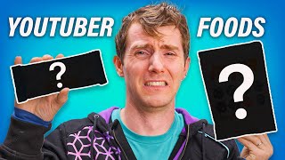
Latest From ShortCircuit:
I tried 20 influencer foods, here are the best… and the worst…


Create an account or sign in to comment
You need to be a member in order to leave a comment
Create an account
Sign up for a new account in our community. It's easy!
Register a new accountSign in
Already have an account? Sign in here.
Sign In Now