Jump to content

Updated UI has too much padding

LogicalDrm

padding.thumb.PNG.588087efe254d98297086542a02c5f1b.PNG


In previous version, my full username could fit to left panel. From new features, post count and what I assume is Best Answer count should only take one row. I think it will fit if padding on both sides of left panel is reduced to half or 70%. While at it, padding between posts should be less, like 1/3 or 1/2, same with right side padding between post and right panel.


The UI for the forums has always been content first, and I do hope it stays like that.


E: Adding, I'm using 150% Windows DPI and 133% browser zoom on 1080p monitor.

^^^^ That's my post ^^^^
<-- This is me --- That's your scrollbar -->
vvvv Who's there? vvvv

Link to comment
Share on other sites

Link to post
Share on other sites

15 minutes ago, LogicalDrm said:

E: Adding, I'm using 150% Windows DPI and 133% browser zoom on 1080p monitor.

So, for me on 100% macOS scale on a 1440x900 display, with 100% on the browser, it seems fine:

image.png.ab8a0f948df0e7d3ffd4dd279e6b5216.png

"A high ideal missed by a little, is far better than low ideal that is achievable, yet far less effective"


If you think I'm wrong, correct me. If I've offended you in some way tell me what it is and how I can correct it. I want to learn, and along the way one can make mistakes; Being wrong helps you learn what's right.

Link to comment
Share on other sites

Link to post
Share on other sites

27 minutes ago, J-from-Nucleon said:

So, for me on 100% macOS scale on a 1440x900 display, with 100% on the browser, it seems fine:

image.png.ab8a0f948df0e7d3ffd4dd279e6b5216.png

Frankly, no it doesn't. Padding is still too noticeable and could be reduced. I have used this forum always with same dpi and zoom. So I only bring those up if someone uses forums with widescreen (these users were the ones that previously complained about too much empty space). Yes, zoom does have effect on how much you can fit in one row. But it doesn't change the fact that padding takes too much of the pixels that could be used for better than just black background.

^^^^ That's my post ^^^^
<-- This is me --- That's your scrollbar -->
vvvv Who's there? vvvv

Link to comment
Share on other sites

Link to post
Share on other sites

1 hour ago, LogicalDrm said:

Frankly, no it doesn't. Padding is still too noticeable and could be reduced. I have used this forum always with same dpi and zoom. So I only bring those up if someone uses forums with widescreen (these users were the ones that previously complained about too much empty space). Yes, zoom does have effect on how much you can fit in one row. But it doesn't change the fact that padding takes too much of the pixels that could be used for better than just black background.

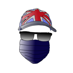
I cannot see the glasses of your avatar in dark mode. It's a floating hat over a face mask.

Link to comment
Share on other sites

Link to post
Share on other sites

18 minutes ago, ShrimpBrime said:

I cannot see the glasses of your avatar in dark mode. It's a floating hat over a face mask.

Partly intended. The black used is near the black of the background.

^^^^ That's my post ^^^^
<-- This is me --- That's your scrollbar -->
vvvv Who's there? vvvv

Link to comment
Share on other sites

Link to post
Share on other sites

1 minute ago, LogicalDrm said:

Partly intended. The black used is near the black of the background.

I don't remember it being that dark though. Maybe it's just my eyes this morning and need more coffee.


LogicalDrm avy.png

Link to comment
Share on other sites

Link to post
Share on other sites

5 minutes ago, ShrimpBrime said:

I don't remember it being that dark though. Maybe it's just my eyes this morning and need more coffee.


LogicalDrm avy.png

Background does seem to be more darker than previously. Maybe it was changed to be pure black instead of dark grey.

^^^^ That's my post ^^^^
<-- This is me --- That's your scrollbar -->
vvvv Who's there? vvvv

Link to comment
Share on other sites

Link to post
Share on other sites

3 hours ago, LogicalDrm said:

Maybe it was changed to be pure black instead of dark grey.

image.png.e6275833e2a971344b7362a925e3c7c0.png

image.png.b2e609caf16a09d0e0cb3e9e37f16316.png

top is black, bottom is dark background.

please quote me or tag me @wall03 so i can see your response

motherboard buying guide      psu buying guide      pc building guide     privacy guide

ltt meme thread

folding at home stats


pc:


RAM: 16GB DDR4-3200 CL-16

CPU: AMD Ryzen 5 3600 @ 3.6GHz

SSD: 256GB SP

GPU: Radeon RX 570 8GB OC

OS: Windows 10

Status: Main PC

Cinebench R23 score: 9097 (multi) 1236 (single)


don't some things look better when they are lowercase?

-wall03


hello dark mode users

goodbye light mode users

Link to comment
Share on other sites

Link to post
Share on other sites

Create an account or sign in to comment

You need to be a member in order to leave a comment

Create an account

Sign up for a new account in our community. It's easy!

Register a new account

Sign in

Already have an account? Sign in here.

Sign In Now

×