
New learner so need feedback

12 hours ago, Souranil21 chakraborty said:Hey can you help me in that ? I don't know how to make that part good. Can i just take a transparent pic and melt it with the background? Is that an option in html or css. Also that is a gradient not a shitty screen.
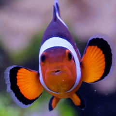
You can use a transparent image, no additional css rules needed. You would just need an image that has transparency (not jpeg, like a png with alpha channel). Though your current image has black labels above logos, you'd want those to be white. An image like this one:

That is what I would do, change the image.
End result:

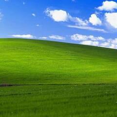
Only if I had no control over image being used would I resort to a CSS rule, like say a profile picture on the forums where the user uploads his own content. In such a case you could use "mask-image" for example (https://developer.mozilla.org/en-US/docs/Web/CSS/mask-image , https://www.w3schools.com/cssref/css3_pr_mask-image.asp).
Make a css class like so (fiddle with the values until you are satisfied with how it looks):
.my-mask{
  -webkit-mask-image: radial-gradient(ellipse 100% 100% at 50% 50%, black 46%, transparent 50%);
  mask-image: radial-gradient(ellipse 100% 100% at 50% 50%, black 46%, transparent 50%);
}
then apply it to your image <img class='my-mask' src=...
End result:

IMHO both look better than the original white square  .
.

-
Topics
-
 0
0 -

derekchan ·
Posted in New Builds and Planning4 -
 0
0 -
 1
1 -
 5
5 -
 1
1 -
 5
5 -

kerriya ·
Posted in Cases and Mods9 -

octester ·
Posted in Troubleshooting7 -

DavidPatrascu ·
Posted in General Discussion9
-
-
play_circle_filled

Latest From ShortCircuit:
The coolest looking monitor. Period. - ASUS ROG display at Computex (Sponsored)


Create an account or sign in to comment
You need to be a member in order to leave a comment
Create an account
Sign up for a new account in our community. It's easy!
Register a new accountSign in
Already have an account? Sign in here.
Sign In Now