Today I'm going to expand on something quickly touched on in a status reply-The DC Metro's loss of an identity.
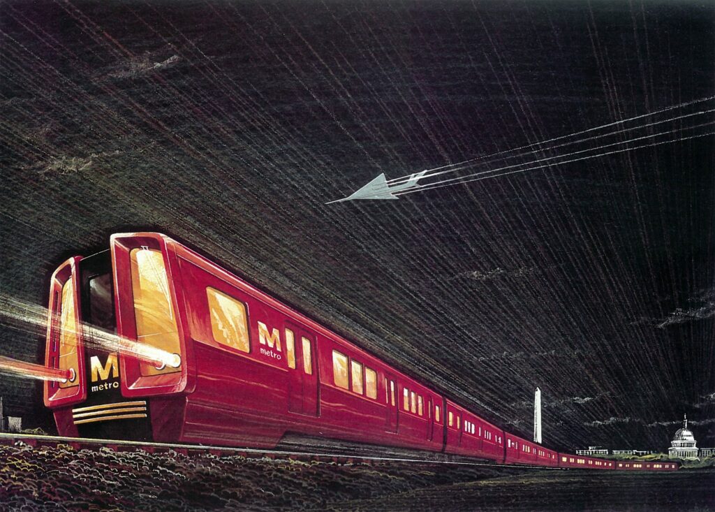
Design was always a big part of the DC Metro. From the grand underground stations with a dim and overall relaxed theme, to the color used around the system. The original idea was to paint the railcars red, as this mockup from the late 1960s shows:

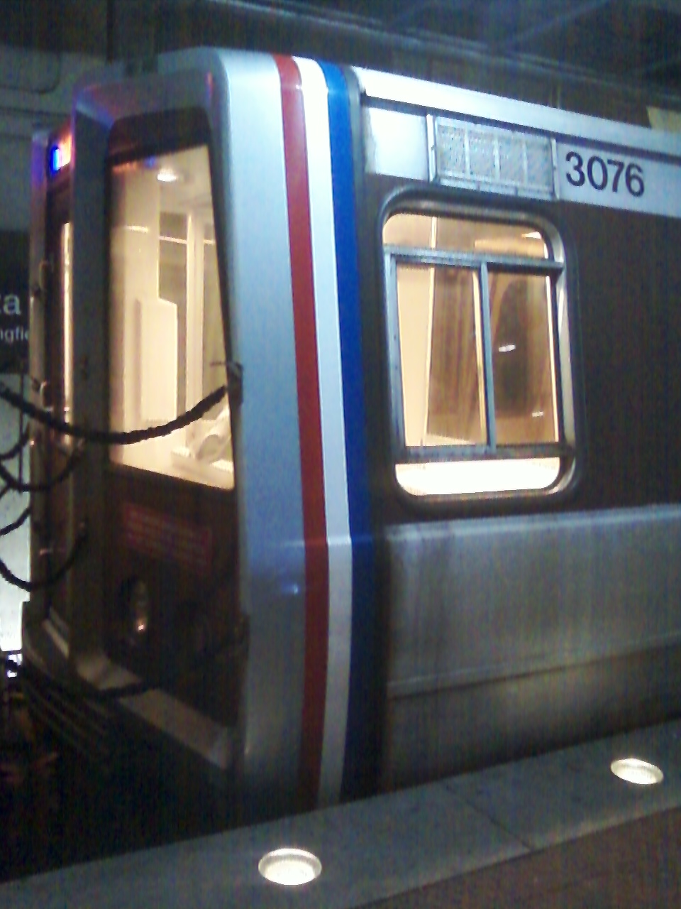
However, due to cost issues, the decision was made to use a largely unpainted design with a large brown stripe. The cab end of railcars also have red, white, and blue pinstripes:
http://www.wirelessnotes.org/wmata/images/3000-series-private-section-cab-exterior.jpg
Most older (AKA pre-mid 2000s) Metro facilities also have a "brown" theme, which has contributed with the color being associated with the Metro. The system also heavily makes use of brutalist design, due to the era it was conceived in.
However, in 2004, Metro took a big step away from their classic designs with the opening of the No Ma-Gallaudet U and Largo Town Center stations, which tried to blend the classic Metro design with something more modern (that I'd frankly expect out of modern NYC Subway stations).
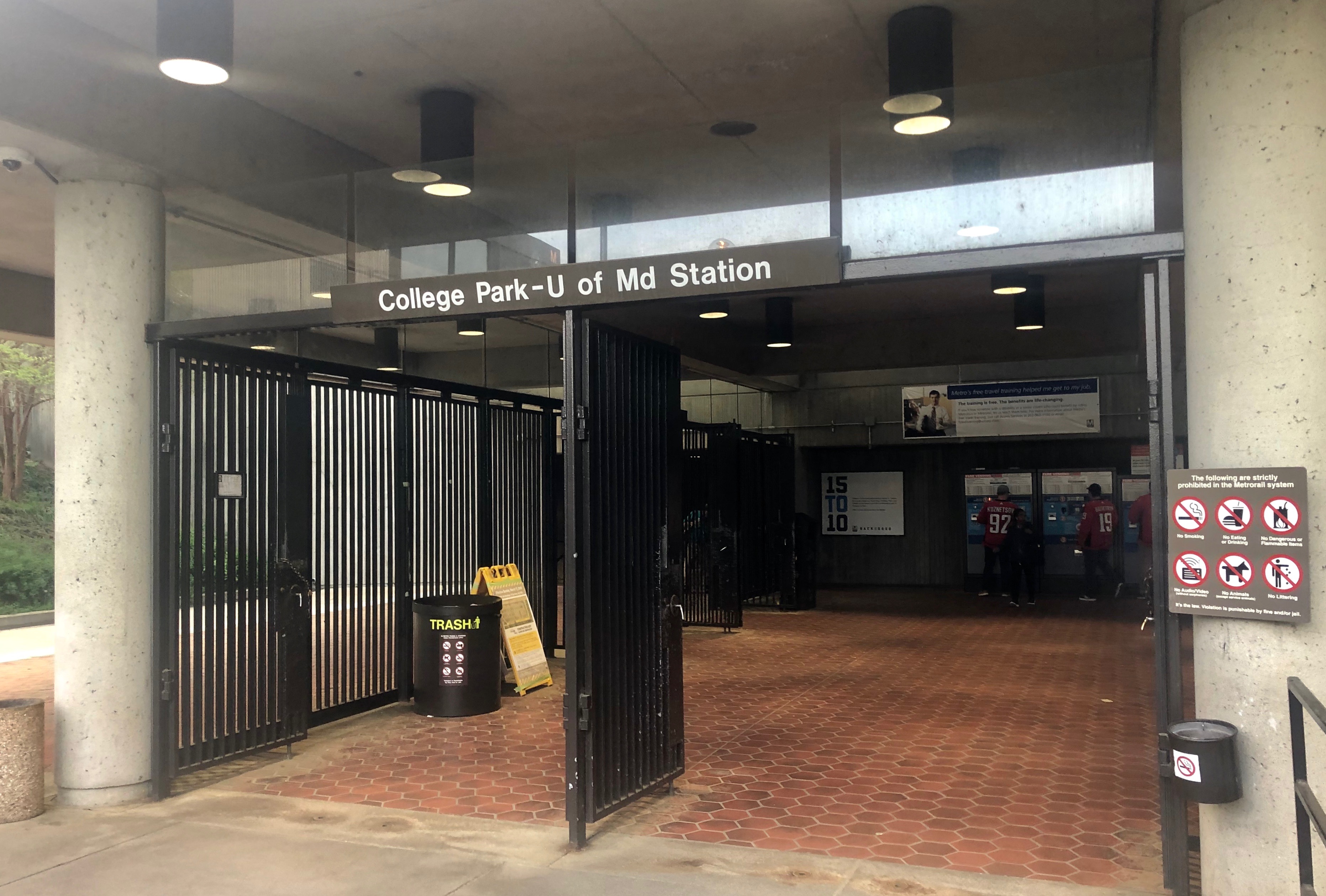
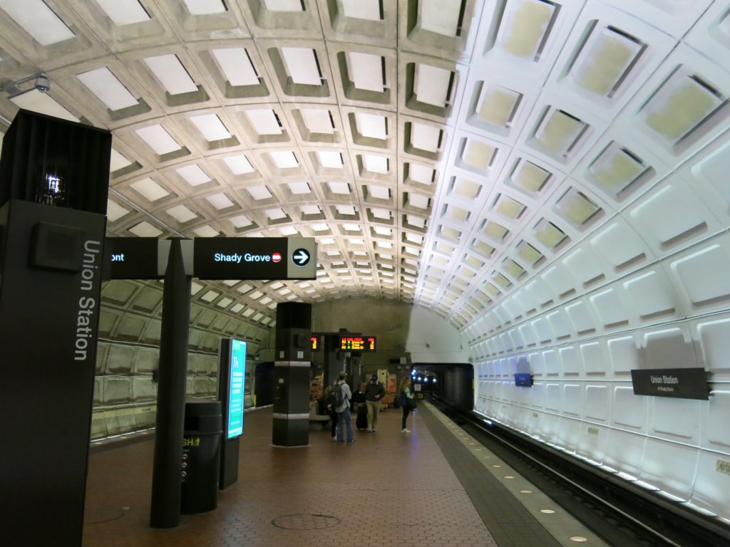
Here's a typical grade-level Metro station:
Here's Largo Town Center, an odd blend of two design styles:
http://photos.wikimapia.org/p/00/00/52/62/02_big.jpg
(I think the old 1000 series parked here helps amplify how much of a contrast these two styles are lol. This pic must be pre-2009 because they sat in the middle of trains after the Red Line collision).
Here's JoeMama-Whatever-U (or if you have any sense, New York Ave station):
Again, a weird mix that doesn't match up with the rest of the system. This station in ironically an infill placed in between Union Station (that's why there are VRE galllery cars and Amfleets in the background) and Rhode Island Ave, which both began operation on the Metro's opening day back in 1976.
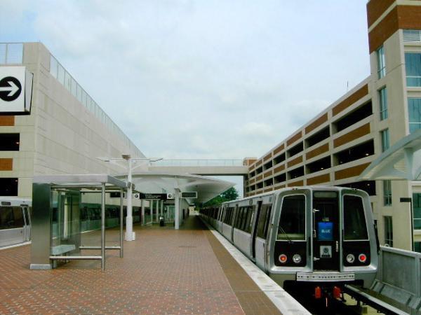
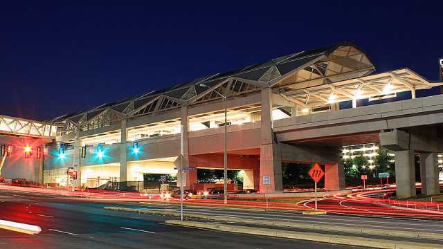
By the way, here's Tysons Corner, a Silver Line station opened in 2014:
Metro has also been ruining other stations with things like their platform improvement program.
They also brightened up Union Station, though there's actual merit to that program--crime reduction. I'd have preferred that they installed brighter lights and didn't repaint the station. I personally don't think the stations are too hazardous anyways.
(This is the station mid-repaint.)
The Metro's newer stations don't fit in with either their classic designs or the designs of the 7000 series, which TBH look like they belong in New York.
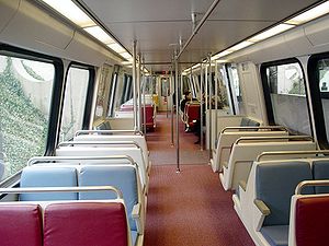
When it comes to railcars, the same story applies. Here's a pre-wrap 3000 series railcar:
(Pre-rehab)
(Post rehab)
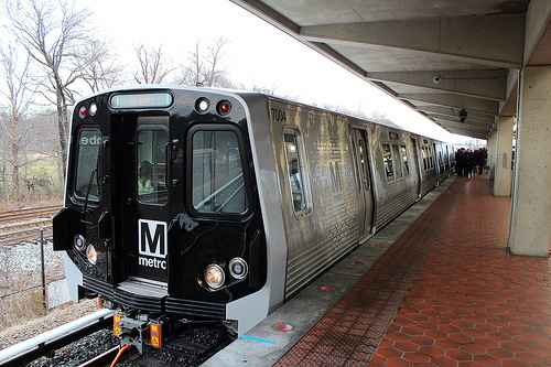
Here's a 7000 series railcar:
Wait, wrong pic.
Yeah, these railcars just don't match the rest of the system. Aside from that, they're really uncomfortable. Compared to the legacy fleet, they're louder (due to their higher weight), worse riding (probably has to do with the weight), have less comfy seats, have really small wind deflectors, and lack the cab jumpseats which are nice and allow for extra privacy. You can also look out of the back while sitting there. Also, the LEDs suck and are too harsh IMO.
And before you complain that we still have it better than places like NY with their plastic bucket seats, keep in mind that the Metro is a hybrid Subway/Commuter system. Trips on the Metro are longer than they are on the NYC Subway. Even a trip from my station (right outside of DC) to the inner city can take about 30 minutes. Longer if you want to go to NoVA.On a positive note, the info displays at the ends of the railcars don't SCREAM AT YOU, though the older railcars were also polite until WMATA changed their programming for some reason. The FIND displays on the 7000s (not pictured here) are also nice, though that would be easy to implement on the older fleets... hell, the 1000 series had rollsigns that served the same function before their 1996 rehabs:
Metro's also been ruining their legacy fleet, look at these wrapped 3000 series railcars:
(Yes, they're so half-assed that Metro forgot to paint the front ends. These also commonly run in sets with classic livery railcars where they look out of place. Not as bad as fleet mixing, which the 7000s helped out with (because they retired the 1 and 4000s, which were not allowed to be at the end of trains. BTW, look at what they did to the glorious red, white, and blue pinstripes! They got replaced with a simple black stripe...)
Some railcars also got new flooring and seats:
(This is a 6000 series railcar. The 6000s have been part of multiple projects like this. Some of these have LEDs (IIRC), and surveillance cams in addition to the floors and stuff being swapped. As of now, the 6000s are sidelined because two of them pulled apart within a single month.)
The 8000 series cars are slated to be more of the same, though they are going to aim for lower weight (thank goodness for that!!!) They could also replace the entirety of the legacy fleet, as the 2/3Ks are getting old, and the 6Ks are sidelined (though I can't see them operating a reduced fleet until 2024... riders have to come back... right?) If the 6Ks stay, hopefully they don't totally screw them up.
Before I end this post, I'd like to point out the weird Metro logo on the 7000 Series:
WTF??? The silver logo isn't much better, either:
(The logo on the 7000 Series is actually a blend of these two, being silver/white-ish with the square explosion design thing).
For a system that is currently touting things like "the great design of our new trains" or "USB ports on the new 8000 series!!!" rather than actually improving service, I think that the decision of moving away from their classic designs is quite stupid. They had a design that worked and was loved by many. Why drop it now? Yeah, it's not modern, but do you see Rockefeller Center or Grand Central being rebuilt into a new style? No!
The WMATA is quite crappy at times

TD;LR, the DC Metro is actively killing it's own identity to look more modern. I think that's stupid.
Also the 7000 series railcars suck ass.


 http://www.wirelessnotes.org/wmata/images/3000-series-private-section-cab-exterior.jpg


0 Comments
There are no comments to display.