


givingtnt
-
Posts
8,147 -
Joined
Reputation Activity
-

 givingtnt got a reaction from InMiseryWeSeekPancakes in No Floatplane access on forum
find help here :
or like, wait for one of the Flight Engineers to come fix your issue here
-

 givingtnt got a reaction from metaleggman in Upgrading from Kentsfield to Yorkfield
id say its a bit more. 35-40..
id say no more than 40$ usd
-
givingtnt got a reaction from metaleggman in Upgrading from Kentsfield to Yorkfield
yes, the 780iSLI is a great board to OC on those chips.
-
givingtnt got a reaction from InMiseryWeSeekPancakes in Will Linus ever update us on what happened to the mining rig?
no profit to be made
takes up valuable space
loud
takes energy
costs money
what else do you need ?
-
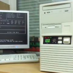
givingtnt got a reaction from InMiseryWeSeekPancakes in Upgrading from Kentsfield to Yorkfield
I don'T buy old cpus
I bought the q6600 because I was on a SUPER STRICT budget for a non-profit organisation that wanted a 3 screen surround + 1 screen instrument panel flight sim for the cheapest ammount possible.
I oced a q6600 to 3.2Ghz on the stock cooler. no nostalgia here.
the mobo cost me more than the cpu and ram combined. and the cpu was at a higher price than usual, but it was the only one I could get on short notice (thanks to the guy who opend his shop on a day off for me)
nostalgia is the stupidest thing for old hardware. it shoudn't affect the price whatsoever on older items, if you look well enough, you'll find someone who sells for a reasonable price.
-
 givingtnt reacted to LinusTech in Upgrading from Kentsfield to Yorkfield
Way too much for that chip, IMO.
-
givingtnt reacted to TVwazhere in 3840x1080 wallpaper extending wrong way with 2 monitors.
Are your monitors misaligned in windows?
You can click and drag them around to align with eachother, it might be whats causing your issue (just type display into the windows start bar)
-

-
.png "Funny") givingtnt reacted to Whiskers in I'm not at liberty to discuss
givingtnt reacted to Whiskers in I'm not at liberty to discuss
Only a thousand? Jeez I got ripped off.
-
 givingtnt got a reaction from Edzel Yago in New LTT Branding
Because of the color wheel and how it works.
You see the purple they're using is a complementary color to the yellow they're using.
Since they're using divided complimentary colors (Blue with both orange and yellow devided complimentary)
It allows them to use the Purple too (as a complimentary of the yellow)
Note : Complimentary is the color directly opposite of one on the color wheel
devided complimentary (or split I guess, dunno the names in En) is the ones on each side of said opposite color on the wheel :
Image Refference :
more or less.
Its a bit of a cheat. but we can get away with it because twice the same color is matched. but its iffy a bit.
The blending with the generally orange color helps it a lot.
You can also match by warm/cold colors. and if you look. the blue is kind of.. random in that respect.
At least the purple/pink is more of a warmer one. whatfor it being transparent.
If the blue was warmer (but then again, Warm blue ??) it could fit better.
also. Purple is kind of rarely a good choice.
Im an exeption. but who tf likes purple ???
For others reading : that's a pretty general rule. don't say you like it because you "wanna be different".. I'll know.
-
givingtnt got a reaction from Edzel Yago in New LTT Branding
Well. you kind of asked why
my answer was both an explanation of why I thought they would do this (add variety to the logo, rather than a single color. (not bad by itself. but experimentation ya know)
I
> and also kind of me telling Ed what was odd about those colors.
but anyways. yes. no one but the staff can truly answer your question here.
-
 givingtnt got a reaction from Dominik W in New LTT Branding
how about this ?
Or this for a more familiar font :
Forgive my borders:
-
 givingtnt got a reaction from ErykYT3 in New LTT Branding
The banner imo is kinda fine
but the logo is a mess
A good logo needs to be :
1. Simple (not "minimalistic" like people like to say nessesarly. but not overly complicated either.)
2. Recognisable
3. Able to stand the changing design eras/styles(edited)
Edit : 4. NOT AMBIGUOUS <-sorta kinda very important
the old one had all 3
the new one has nothing.
if whoever made it is reading this
sorry to be harsh, but otherwise you won't know the truth.
ALSO :
Other than the colors, the banner and the logo don't match.
There's no recuring lines, no similarities other than the colors
and that's just not enough
-
givingtnt got a reaction from LogicalDrm in New LTT Branding
Also.
This is why I think it should be colored text/circle on a white background.
sure. it looks nice like this on a dark youtube theme :
but its weird on a white one imo :
-
 givingtnt got a reaction from Spotty in New LTT Branding
Also.
This is why I think it should be colored text/circle on a white background.
sure. it looks nice like this on a dark youtube theme :
but its weird on a white one imo :
-
givingtnt reacted to OGH2020 in GTX 1070 Ti SC GAMING vs GTX 1070 Ti FTW2 GAMING iCX
I want the better GPU
-
givingtnt reacted to Tog Driver in New LTT Branding
(Holy shit, LTT Staff, Hi Edzel!)
yeah, I like the Tide logo, at first the one with so many colours I didn't even realize it said LTT, just thought it was random colours. The Tide one is easily understandable.
-
givingtnt reacted to Edzel Yago in New LTT Branding
One issue some people have noticed, and I agree with, is that the current refresh logo isn't strong enough when viewed as an icon alongside other channels/brands. When you look at a feed/list/wall of channel portrait icons, it doesn't stand out.
It's important to be able to filter out the useful feedback and not just dismiss negative reactions as just being blind hate.
-
givingtnt reacted to nicklmg in Translating Linus Tech Tips videos to reach a larger Indian audience
Hey folks,
One of my goals over the next 12 months is making our content more accessible for everyone around the globe. An audience that we feel has been under-served by us in the past is the ever-growing Indian audience on YouTube - and I want to ensure that we rectify that as soon as possible.
Based on our light research it seems like Hindi would be the primary language to look at at this time (though members of the community with more knowledge can feel free to correct me if I have the wrong perception!).
We're obviously exploring talks with professionals in this field, but I'm curious if we may be able to start more of a grass-roots movement... YouTube's capabilities in terms of facilitating community translations has increased greatly over the last few years, and I'm confident that bilingual members of our community could probably do just as well as professionals... The key thing here would be reliability and dependability. There would be compensation available, we'd just have to figure out how that might end up working out.
Anyway... at this time I'm really just interested in starting a conversation around this and learning what options may be available thanks to the amazing nature of this community
-
givingtnt reacted to Edzel Yago in New LTT Branding
Yeah. =P I'll tell him to check this thread and get into the conversation more.
-
-

-
 givingtnt got a reaction from Opencircuit74 in New LTT Branding
or even more edgy !
My point is, you're trying thinking too hard.
-
 givingtnt got a reaction from haloflyer in New LTT Branding
The banner imo is kinda fine
but the logo is a mess
A good logo needs to be :
1. Simple (not "minimalistic" like people like to say nessesarly. but not overly complicated either.)
2. Recognisable
3. Able to stand the changing design eras/styles(edited)
Edit : 4. NOT AMBIGUOUS <-sorta kinda very important
the old one had all 3
the new one has nothing.
if whoever made it is reading this
sorry to be harsh, but otherwise you won't know the truth.
ALSO :
Other than the colors, the banner and the logo don't match.
There's no recuring lines, no similarities other than the colors
and that's just not enough
-
 givingtnt got a reaction from LAwLz in New LTT Branding
The banner imo is kinda fine
but the logo is a mess
A good logo needs to be :
1. Simple (not "minimalistic" like people like to say nessesarly. but not overly complicated either.)
2. Recognisable
3. Able to stand the changing design eras/styles(edited)
Edit : 4. NOT AMBIGUOUS <-sorta kinda very important
the old one had all 3
the new one has nothing.
if whoever made it is reading this
sorry to be harsh, but otherwise you won't know the truth.
ALSO :
Other than the colors, the banner and the logo don't match.
There's no recuring lines, no similarities other than the colors
and that's just not enough


